


 Claim Ownership
storytelling with data podcast
Subscribed: 1,052Played: 19,757
Subscribe

© storytelling with data
Description
Rid your world of ineffective graphs and mediocre presentations, one exploding 3D pie chart at a time! The storytelling with data podcast from bestselling author, speaker and workshop guru, Cole Nussbaumer Knaflic covers topics related to data storytelling, better presentations, and all things data viz.
116 Episodes
Reverse
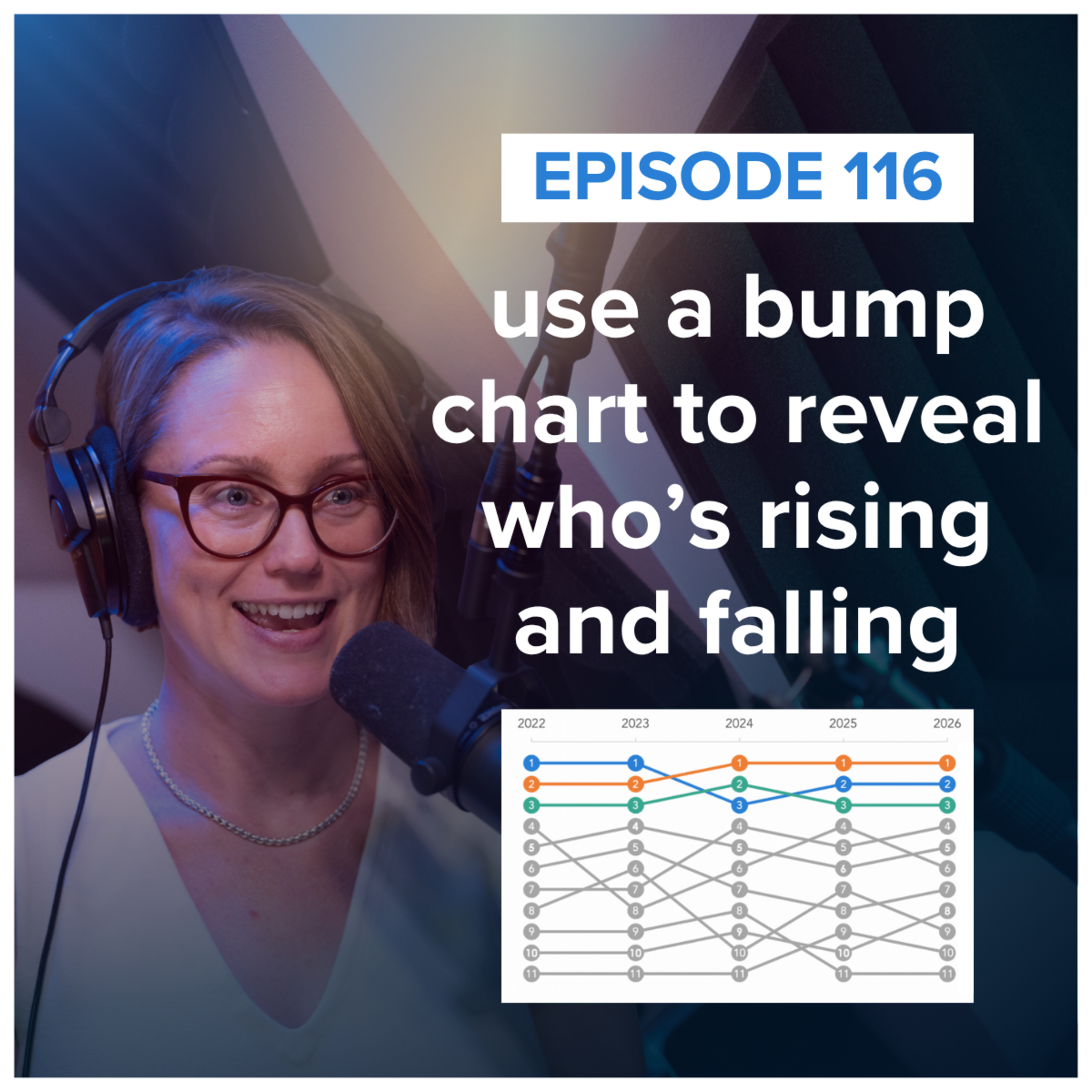
Bump charts are great at showing who's rising, who's falling, and who's staying on top—but they don't tell you the whole story.In this episode, Alli explains what a bump chart is, when to use one, and what to watch out for when comparing rankings instead of actual values. Plus, she highlights three creative examples from the storytelling with data community that use color, added context, and an unexpected layout to make changes in rankings easier to see and understand.RESOURCES MENTIONED:Show notes: https://www.storytellingwithdata.com/podcast/116Register for the Nov 5th live, public workshopUse the code PODCAST10 for 10% off!September community challenge about bump chartsMehrol’s bump chart about Olympic medalsJeffrey’s bump chart about airlinesAkindynos’ bump chart about notices from the Greek governmentDatawrapper: How to create a Bump Chart (Article)Jon Schwabish: Create a Bump Chart in Flourish (Video)Jon Schwabish: Create a Bump Chart in Excel (Article)

Does telling a story with data introduce bias? In this episode, Cole explores the tension between objectivity and perspective—and why simply “showing the data” isn’t as neutral as it may seem. If you’ve ever worried that storytelling could compromise rigor, learn how to bring your expertise and point of view to the data while still communicating uncertainty, limitations, and alternative interpretations responsibly.RESOURCES MENTIONED:Show notes: https://www.storytellingwithdata.com/podcast/115Schedule your storytelling with data team trainingDownload our free SWD + AI Primer PDF documentArticle: lead with storyArticle: so what?
Cole recently appeared on the Analytics Power Hour, and this was such a great conversation, we're rebroadcasting it here!————There’s a version of this episode where AI replaces the data visualization expert entirely, and there’s a version where it’s useless without one. Neither is quite right, according to Cole Nussbaumer Knaflic of Storytelling with Data, who joined Tim, Moe, and Julie to sort out where AI genuinely earns its keep in data storytelling and where it’s just producing a shinier first draft of the same shitty slide. Cole—admittedly a skeptic-turned-convert who once joked she’d retire before having to deal with any of this—walks through why the humans who benefit most from AI are the ones who already have the foundation to know when to ignore it, why “let me look at some options” beats “give me the final chart” as a prompt, and why the analog, pencil-and-paper parts of the process might be the most valuable friction in the whole workflow. Bring your own opinions on whether Claude should ever be handed “the rules” and told to just go.RESOURCED MENTIONED:Show notes: https://www.storytellingwithdata.com/podcast/114Schedule your storytelling with data team trainingDownload our free SWD + AI Primer PDF documentArticle: using AI without giving up control (Alex Velez)Video: Data Storytelling in the Age of AIStorytelling with Data: AI ResourcesStorytelling with Data: AI WorkshopsMerlin Bird ID (app)Choiceology: The Algorithm Advantage (podcast)What kind of reader are you? (assessment)Funky Saurus by Matt Coen (video)
What can AI help us see, try, or explore that we couldn’t easily do before? Alli shares three standout talks from the 2026 Outlier conference—and three lessons for using AI in data visualization: - Use AI to expand your options without outsourcing your judgment.- Give AI the information it needs to critique its work.- Use AI to find what’s worth visualizing in the first place.RESOURCES MENTIONED:Show notes: https://www.storytellingwithdata.com/podcast/113Schedule your storytelling with data team trainingDownload our free SWD + AI Primer PDF documentOutlier Conference 2026 YouTube PlaylistSurbhi Bhatia’s “DraftGPT: fast ≠ finished in vibe-coding data visualisation.”Madeleine Filloux’s “How we cloned our visualization team.”Nihanth Cherukuru’s “Emerging Opportunities at the Intersection of AI and Visualization.”
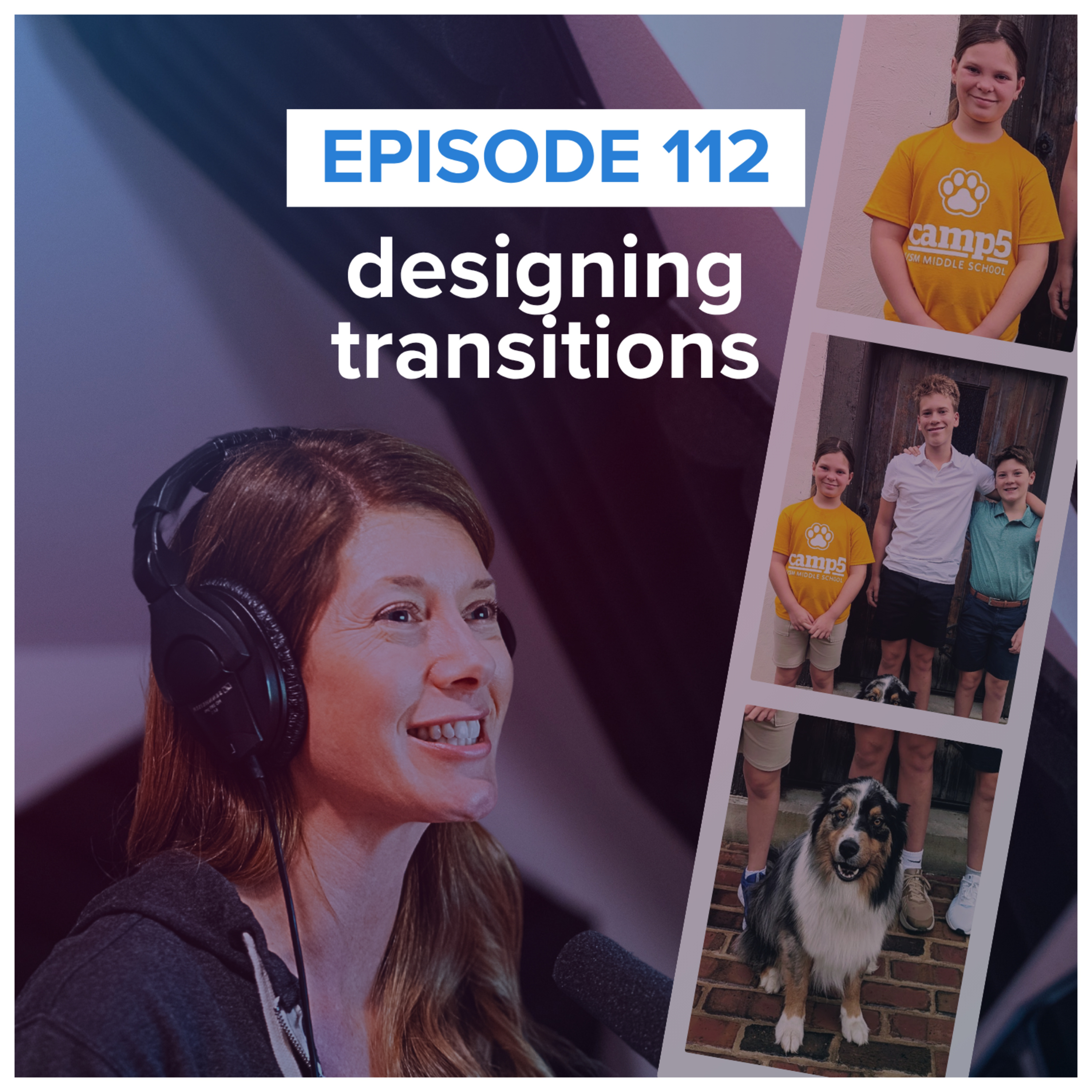
What happens in the space between one thing and the next? Whether you’re moving from email to deep thinking, analysis to communication, or one idea to another, these shifts require time and mental energy. In this episode, Cole explores how thoughtfully designing transitions can help you work, think, and communicate more effectively. Discover practical ways to use time, space, movement, and other cues to shift your mindset—and help your audience follow your story. Small changes in how you get from here to there can make a surprisingly big difference.RESOURCES MENTIONED:Show notes: https://www.storytellingwithdata.com/podcast/112Join the next cohort of our public 8-week online course: plan, create & deliver - use the code PODCAST10 for 10% off!Book your storytelling with data team training!Episode 83: reflect & refine (sharing statio, a meditative pause during a transition)Episode 6: say it out loudEpisode 86: speak so others listen

Comments

Download from Google Play

Download from App Store
 United States