


 Claim Ownership
AtoZ CSS

Description
Tue, 26 Apr 2016 14:01:44 +0000
Tue, 26 Apr 2016 14:01:44 +0000
Made with love and CSS by Guy Routledge in 2014. All rights reserved.web,design,development,css,html,screencast,video,frontend,responsive,rwd,webdev,education,technology,entrepreneurTechnology/Software How-Tomail@guyroutledge.co.ukGuy Routledge: front-end developer, teacher and screencasterGuy Routledge: front-end developer, teacher and screencasternoweb,design,development,css,html,screencast,video,frontend,responsive,rwd,webdev,education,technology,entrepreneurLearn CSS and sharpen your front-end skills with this totally free 26-part video seriesAtoZ CSS is a video podcast that tackles one CSS topic per letter of the alphabet. From auto to z-index, take a deep dive into a single property, value, selector or concept each week.
AtoZ CSS Episode26: Z-index
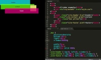
Some interface designs may call for elements to be layered or stacked on top of each other.
There are many ways that elements will naturally stack on top of each other. But we can control this stacking order using a combination of the `position` and `z-index` properties.
In this final episode of AtoZ CSS season one we'll learn about:
The default stacking order of the document
What a stacking context is and how they interact with each other
How z-index controls layer order within stacking contexts
And a method I use for standardising z-index across a project
Thu, 30 Oct 2014 11:05:12 +0000
wistia-media-10438157
AtoZ CSS Episode26: Z-index
AtoZ CSS Episode26: Z-index
AtoZ CSS Episode26: Z-index
mail@guyroutledge.co.uk (Guy Routledge: front-end developer, teacher and screencaster)no Some interface designs may call for elements to be layered or stacked on top of each other. There are many ways that elements will naturally stack on top of each other. But we can control this stacking order using a combination of the `position` and `zGuy Routledge: front-end developer, teacher and screencaster Some interface designs may call for elements to be layered or stacked on top of each other. There are many ways that elements will naturally stack on top of each other. But we can control this stacking order using a combination of the `position` and `z-index` properties. In this final episode of AtoZ CSS season one we'll learn about: The default stacking order of the document What a stacking context is and how they interact with each other How z-index controls layer order within stacking contexts And a method I use for standardising z-index across a project web,design,development,css,html,screencast,video,frontend,responsive,rwd,webdev,education,technology,entrepreneur
AtoZ CSS Episode 25: rotateY
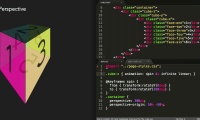
In the previous episode we learned about the transform property and the value translateX(). In this episode we'll be digging deeper into transforms and manipulating elements in 3D.
In this episode we'll learn all about:
3D space in CSS
How to rotate elements around their vertical and horizontal axis
And how perspective works
Thu, 23 Oct 2014 16:45:13 +0000
wistia-media-10216479
AtoZ CSS Episode 25: rotateY
AtoZ CSS Episode 25: rotateY
AtoZ CSS Episode 25: rotateY
mail@guyroutledge.co.uk (Guy Routledge: front-end developer, teacher and screencaster)no In the previous episode we learned about the transform property and the value translateX(). In this episode we'll be digging deeper into transforms and manipulating elements in 3D. In this episode we'll learn all about: 3D space in CSS How to rotate elGuy Routledge: front-end developer, teacher and screencaster In the previous episode we learned about the transform property and the value translateX(). In this episode we'll be digging deeper into transforms and manipulating elements in 3D. In this episode we'll learn all about: 3D space in CSS How to rotate elements around their vertical and horizontal axis And how perspective works web,design,development,css,html,screencast,video,frontend,responsive,rwd,webdev,education,technology,entrepreneur
AtoZ CSS Episode 24: TranslateX
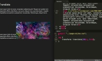
As we approach the end of the alphabet, and the end of the first season of AtoZ CSS, there aren’t many properties, values or concepts that start with the letter X.
There are however a series of transform values that allow elements to have their visual co-ordinates changed along the x-axis to create complex and interesting visual details on the page.
In this episode we’ll learn all about:
The CSS transform property
Moving elements with translate and translateX
The performance benefits of using translate over other methods
Thu, 16 Oct 2014 07:56:34 +0000
wistia-media-9963467
AtoZ CSS Episode 24: TranslateX
AtoZ CSS Episode 24: TranslateX
AtoZ CSS Episode 24: TranslateX
mail@guyroutledge.co.uk (Guy Routledge: front-end developer, teacher and screencaster)no As we approach the end of the alphabet, and the end of the first season of AtoZ CSS, there aren’t many properties, values or concepts that start with the letter X. There are however a series of transform values that allow elements to have their visual Guy Routledge: front-end developer, teacher and screencaster As we approach the end of the alphabet, and the end of the first season of AtoZ CSS, there aren’t many properties, values or concepts that start with the letter X. There are however a series of transform values that allow elements to have their visual co-ordinates changed along the x-axis to create complex and interesting visual details on the page. In this episode we’ll learn all about: The CSS transform property Moving elements with translate and translateX The performance benefits of using translate over other methods web,design,development,css,html,screencast,video,frontend,responsive,rwd,webdev,education,technology,entrepreneur
AtoZ CSS Episode23: Widows
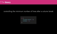
More and more these days, CSS is being used to control the styling of things other than websites.
One type of media that CSS can apply styling to is paged media - things like digital magazines and ebooks or a website in the form of a print stylesheet.
There are some properties that only apply to this media type. The widows and orphans properties are two that allow us to control how lines of text flow around page breaks.
In this episode we’ll learn about:
Paged media and
Widows and Orphans
Thu, 09 Oct 2014 15:39:39 +0000
wistia-media-9758049
AtoZ CSS Episode23: Widows
AtoZ CSS Episode23: Widows
mail@guyroutledge.co.uk (Guy Routledge: front-end developer, teacher and screencaster)no More and more these days, CSS is being used to control the styling of things other than websites. One type of media that CSS can apply styling to is paged media - things like digital magazines and ebooks or a website in the form of a print stylesheet. Guy Routledge: front-end developer, teacher and screencaster More and more these days, CSS is being used to control the styling of things other than websites. One type of media that CSS can apply styling to is paged media - things like digital magazines and ebooks or a website in the form of a print stylesheet. There are some properties that only apply to this media type. The widows and orphans properties are two that allow us to control how lines of text flow around page breaks. In this episode we’ll learn about: Paged media and Widows and Orphans web,design,development,css,html,screencast,video,frontend,responsive,rwd,webdev,educa


 United States