Mastering the Art of Dashboard Design: Transforming Data into Actionable Insights
Description
During my journey into the world of data visualization, I was struck by how often well-intentioned dashboards miss the mark. One day, while reviewing various dashboards created for a retail chain, I found myself wondering: why do some dashboards receive rave reviews, while others languish in obscurity? The answer lies in the way we approach design and communication with stakeholders.
DataScience Show is a reader-supported publication. To receive new posts and support my work, consider becoming a free or paid subscriber.
Understanding Stakeholder Needs: The Foundation of Effective Dashboards
When it comes to designing dashboards, it's easy to fall into the trap of assumptions. We might think we know what stakeholders need. But the truth is, miscommunication and assumptions can lead to wasted efforts. Have you ever spent hours creating a report, only to find out it didn't meet anyone's expectations? I have, and it’s frustrating! That's why understanding stakeholder needs is crucial.
Miscommunication and Assumptions: The Pitfalls
Miscommunication can derail the dashboard design process. Too often, we take for granted that we understand the specific needs of our stakeholders. Instead, we should approach this with an open mind. It’s vital to ask direct questions and clarify any assumptions. This way, we can avoid unnecessary work.
* Stakeholder needs are often misunderstood.
* Direct communication is key.
For instance, if a stakeholder says they want to “see sales data,” what do they really mean? Do they want a quick snapshot or a deep dive into trends? The answer could vary greatly, and it’s our job to find out.
Tailoring Questions for Actionable Insights
Next, let’s talk about the art of asking questions. Tailoring our inquiries can help extract actionable insights. Take a moment to think about this: Have you ever asked a vague question and received a vague answer? It happens to the best of us.
Instead of asking, “What do you want in your dashboard?” try something more specific, like, “What decisions do you plan to make based on this data?” This approach leads us closer to understanding their true needs.
"True understanding only comes when we take the time to ask the right questions."
Building a Stakeholder Interview Framework
To dig deeper, building a structured stakeholder interview framework can be incredibly helpful. This framework should emphasize decision questions, audience specifics, and operational context. For example, you might ask:
* How will you use this information?
* What specific decisions do you need to make?
* Are there any specific metrics that are crucial for your role?
When we adopt this approach, we can gather clear requirements and avoid misalignment of expectations. For instance, I once worked with a team where leadership realized they needed specific coaching details instead of a broad overview. By refining our questions, we saved time and resources.
Highlighting Decision-Making Context in Dashboards
Once we have a grasp on what stakeholders need, we must ensure that dashboards highlight the decision-making context. This means that each visual element should support the decisions stakeholders need to make. Think about this: Is your dashboard merely displaying data, or is it helping users make informed decisions?
This distinction is crucial. For example, a dashboard designed for a CEO might focus on strategic metrics, while a sales director's dashboard would emphasize team performance metrics. By understanding the context, we make our dashboards more relevant and useful.
Using Feedback Cycles to Refine Understanding
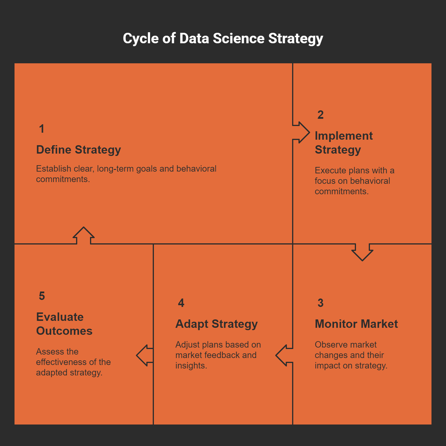
Lastly, incorporating feedback cycles can refine our understanding of stakeholder needs. After presenting a preliminary version of the dashboard, encourage stakeholders to provide input. What do they like? What’s missing? By continuously iterating based on feedback, we can enhance the dashboard’s effectiveness.
It’s about creating a dialogue, not a monologue. Regular check-ins help us stay aligned with stakeholder needs, ensuring that the final product meets their expectations. Also, remember that these cycles can reveal placeholder metrics versus actionable metrics. Focus on what truly drives decisions.
In conclusion, by understanding stakeholder needs, we can create effective dashboards that resonate with their requirements. Through direct communication, tailored questions, and ongoing feedback, we become not just designers of data, but partners in decision-making. And isn't that the ultimate goal? To empower stakeholders through insightful, meaningful dashboards!
Dashboard Design: Balancing Simplicity and Detail
When it comes to dashboard design, the balance between simplicity and detail is crucial. Let’s dive into a comparison of what I call Dashboard A and Dashboard B. These two dashboards showcase the significant impact that design choices can have on user experience. In my recent exploration, I discovered some interesting insights.
The Case of Dashboard A vs. Dashboard B
Dashboard A features four key metrics and presents them in a clean layout. This minimalist approach promotes clarity. On the other hand, Dashboard B overwhelms users with twelve metrics displayed chaotically. Initially, 65% of users preferred Dashboard B due to its complexity. However, user testing revealed that Dashboard A was more effective in delivering meaningful insights. This leads me to question: why do we often favor complexity over simplicity?
It's a common misconception that more information equals better decision-making. In reality, too much data can cloud judgment. Dashboard A’s simplicity allowed users to engage with the data effectively, highlighting the importance of clarity and focus.
Elements of Clarity and Visual Hierarchy
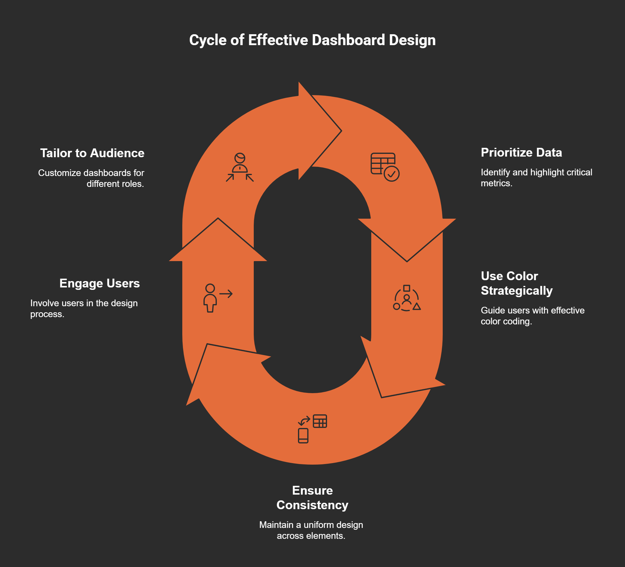
Understanding how to create clarity in dashboard design is essential. One key aspect is visual hierarchy. This means organizing information so that the most important elements stand out. For example, using larger fonts or more vibrant colors can draw attention to key metrics.
* Prioritize critical data.
* Use color strategically to guide users.
* Ensure consistency in design elements.
When users can effortlessly navigate through information, they can make quicker, more informed decisions. This contributes to better engagement and ultimately leads to improved outcomes.
Why Less is Often More in Design
Leonardo da Vinci said,
"Simplicity is the ultimate sophistication."
This quote resonates deeply with dashboard design. Stripping away unnecessary elements can enhance user focus. A well-designed dashboard is not just about aesthetics; it’s about effectively communicating information.
Consider this: if you were presented with two options, one that screamed at you with colors and numbers, and another that spoke softly yet clearly, which would you choose? I believe most of us would gravitate towards the latter. Less truly can be more when it comes to design.
Explorative Analysis: Letting User Engagement Lead the Way
User engagement is a vital part of dashboard design. We must allow it to guide our decisions. What do users want? What do they need? Through user testing, we can uncover surprising preferences. I’ve found that engaging users early in the design process leads to more tailored solutions.
In fact, when stakeholders articulate their decision-making processes, we can align the dashboards to their needs. This means not just asking them what they want, but also how they plan to use it. This approach can lead to actionable insights that boost engagement.
Utilizing Audience-Centric Design for Different Roles
Each dashboard serves a different purpose depending on the audience. For instance, a CEO might need high-level strategic metrics, while a sales director requires performance metrics relevant to specific goals. Tailoring designs to meet the unique needs of various roles is paramount.
When creating dashboards, think about who will be using them. Will it be executives making high-stakes decisions or analysts diving into the data? Adapting the design to suit these different audiences ensures that the right insights are delivered effectively.
As we navigate through these principles of dashboard design, it’s clear that understanding the balance between simplicity and detail is key. By focusing on clarity, engaging users, and employing audience-centric designs, we can create dashboards that not only look good but also serve as powerful tools for decision-making.
Avoiding the 'Deadly Dashboard Sins'
When it comes to dashboards, we often find ourselves at a crossroads. On one side, we have the desire to present as much data as possible. On the other, we have the need for clarity and usability. This is where the 'deadly dashboard sins' come into play. Understanding these pitfalls is essential for creating visualizations that genuinely help users make decisions.
1. Information Overload
Think about this: Have you ever looked at a dashboard and felt overwhelmed by the sheer amount of information? Information overload can paralyze decision-making. When too much data is thrown at users, it becomes challenging to identify the key insights. Instead of empowering stakeholders, complex dashboards can lead to confusion and frustration.
Statistics

