


E-commerce UX Secrets: What 200,000 Hours of Research Reveals About Conversion
Description
If you run an e-commerce site or work on digital products, this conversation is packed with research-backed insights that could transform your conversion rates.
Apps of the Week
Before we get into our main discussion, we want to highlight a couple of tools that caught our attention recently.
UX-Ray 2.0
We talked about this last week, but it deserves another mention. UX-Ray from Baymard Institute is an extraordinary tool built on 150,000 hours (soon to be 200,000 hours) of e-commerce research. You can scan your site or a competitor's URL, and it analyzes it against Baymard's research database, providing specific recommendations for improvement.

What makes UX-Ray remarkable is its accuracy. Baymard spent almost $100,000 just setting up a test structure with manually conducted UX audits of 50 different e-commerce sites across nearly 500 UX parameters. They then compared these line by line to how UX-Ray performed, achieving a 95% accuracy rate when compared to human experts. That accuracy is crucial because if a third of your recommendations are actually harmful to conversions, you end up wasting more time weeding those out than you saved.
Currently, UX-Ray assesses 40 different UX characteristics. They could assess 80 parameters if they dropped the accuracy to 70%, but they chose quality over quantity. Each recommendation links back to detailed guides explaining the research behind the suggestion.
For anyone working in e-commerce, particularly if you're trying to compete with larger players, this tool is worth exploring. There's also a free Baymard Figma plugin that lets you annotate your designs with research-backed insights, which is brilliant for justifying design decisions to stakeholders.
Snap
We also came across Snap this week, which offers AI-driven nonfacilitated testing. The tool claims to use AI personas that go around your site completing tasks and speaking out loud, mimicking user behavior.
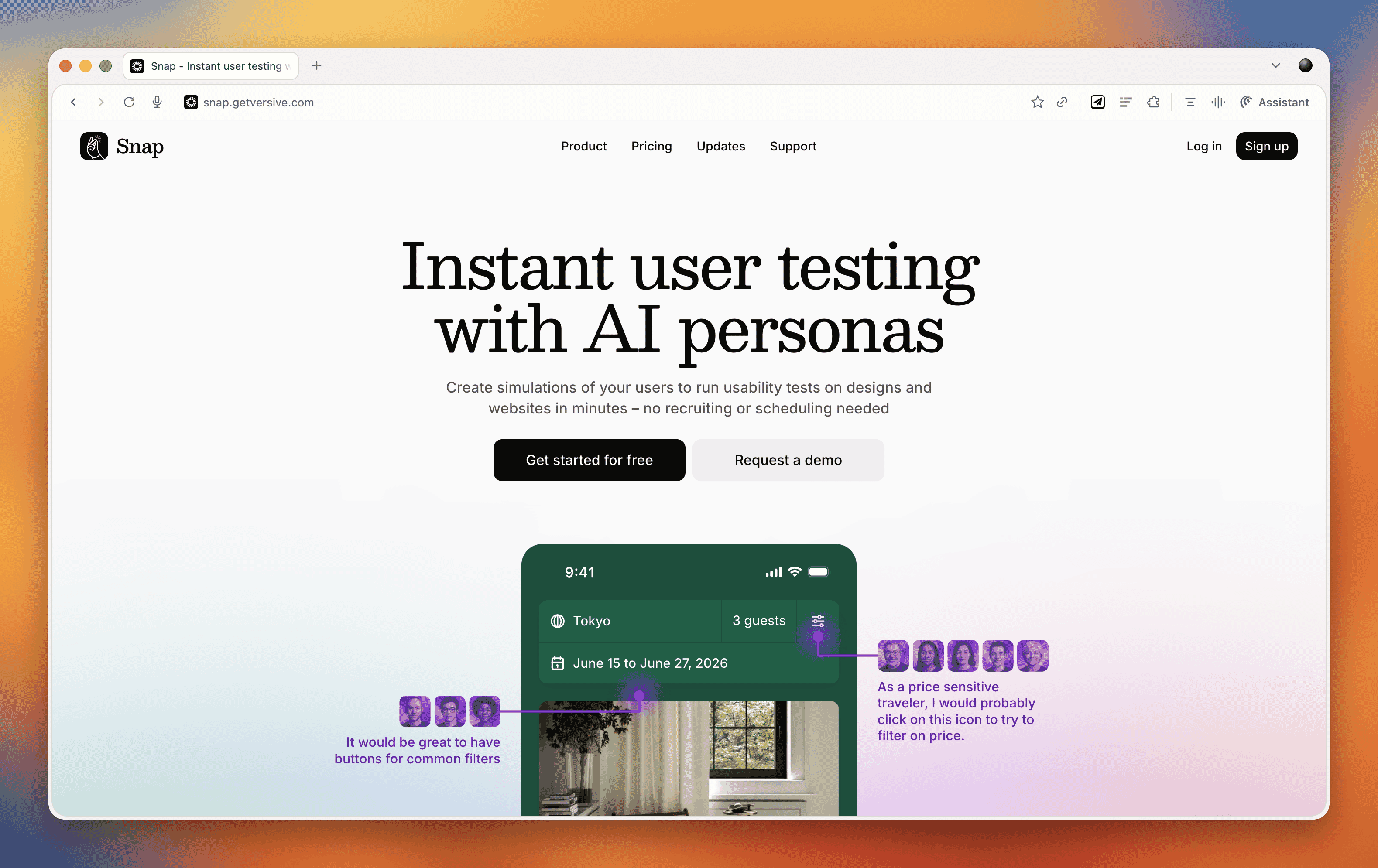
These kinds of tools do our heads in a bit. On one hand, we're incredibly nervous about them because they could just be making things up. There's also the concern that they remove us from interacting with real users, and you don't build empathy with an AI persona the way you do with real people. But on the other hand, the pragmatic part of us recognizes that many organizations never get to do testing because management always says there's no time or money. Tools like this might enable people who would otherwise never test at all.
At the end of the day, it comes down to accuracy and methodology. Before using any such tool, you should ask them to document their accuracy rate and show you that documentation. That will tell you how much salt to take their output with.
E-commerce UX Best Practices with Christian Holst
Our main conversation this month is with Christian Holst, Research Director and Co-Founder of Baymard Institute. We've been following Baymard's work for years, and having Christian on the show gave us a chance to dig into what nearly 200,000 hours of e-commerce research has taught them about conversion optimization.
The Birth of Baymard Institute
Christian shared the story of how Baymard started about 15 years ago. His co-founder Jamie was working as a lead front-end developer at a medium-sized agency, and he noticed something frustrating about design decision meetings. When the agency prepared three different design variations, the decision often came down to who could argue most passionately (usually the designer who created that version), the boss getting impatient and just picking one, or the client simply choosing their favorite.
Rarely did anyone say they had large-scale user experience data to prove which design would actually work better. They realized they could solve this problem by testing general user behavior across sites and looking for patterns that transcend individual websites. If they threw out the site-specific data and only looked for patterns across sites, they could uncover what are general user behaviors for specific UI components and patterns.
It started with just checkout flows. It wasn't even clear they would ever move beyond that. But now, 15 years later, Baymard has a team of around 60 people, with 35 working full-time on conducting new research or maintaining existing research.
The Role of Research-Backed Guidelines
One important point Christian emphasized is that Baymard's research isn't meant to replace your own internal testing. You should always do your own data collection and usability testing. The point of having a large database of user behavior and test-based best practices is that when you're redesigning something, you have maybe 100 micro decisions to make. You can't run internal tests for every single one of those decisions.
Even Fortune 500 companies that have the budget don't have the time to wait for results on every micro decision. So what happens is you collect research on the two or three big things that are site-specific or unique to your brand or customer demographic. But all the generic stuff (how to design an expand and collapse feature, how the quantity field should work, how the phone field should be designed in a checkout flow) these are extremely standardized UI components where users have standardized expectations.
You shouldn't squander your internal test resources on testing things that are completely generic. That's where pre-made research comes in. It removes 97 of the micro decisions so you can focus your resources on what's unique and important to your brand.
Common E-commerce Conversion Killers
We asked Christian what kills conversion the most on e-commerce sites. While it depends on each site's specific issues, there are some concrete things Baymard has consistently seen sites fail at that are surprisingly easy to fix.
The Order Review Trap
In countries where you have an order review step (where users review the whole order before pressing "place order"), there's a really dangerous trap. The order review step and the order confirmation step look very similar in users' minds. Both are textual pages that appear after entering credit card data. Both show a summary of information.
In testing, Baymard consistently sees some users misinterpret the order review step for a confirmation step. This is a critical error because these users will exit the page thinking they've completed their order. They don't even realize the abandonment occurred. It's the worst type of checkout abandonment that can happen.
A very simple trick is to take the "place order" button that you usually have at the bottom of the page and duplicate it so there's also one at the top of the page. One audit client did this and got a $10 million return on investment from just duplicating that button. It won't affect 10% of users, but if it prevents one out of 200 users from abandoning, that's half a percent of all your site revenue you've recovered.
Error Recovery Experience
Christian called this "the least sexy but most important topic" in checkout flows. The general error recovery experience in checkout flows has improved over the 15 years Baymard has been researching, but it's still way too poor.
When a validation error occurs, users struggle with three things:
- Understanding that an error actually happened
- Understanding where the error is
- Understanding how to resolve it
Best practices for error recovery:
- Provide visual styling for each field that's wrong
- Have a description at the top of the page that outlines all errors
- Use conditional logic: if there's only one error, scroll them to that field. If there are multiple errors, scroll to the top where they can see the overview
Baymard sees users who fix one error, resubmit, and then get frustrated when the page reloads with another error they didn't see. They sometimes conclude the page is broken. When Baymard surveys users, 6% say they've abandoned a checkout flow in the past quarter due to perceived technical errors. Most of these aren't actual technical errors, the page is just extremely complicated to use.
Adaptive Error Messages
Instead of saying "phone number is invalid," tell users exactly why. Your technical system knows exactly which validation rule was triggered. If the phone number is wrong because it includes a special character, tell them: "Special characters cannot be used. You don't need to include the country code." If it's too long or too short, say that specifically. This helps users recover faster.
Ideally, much of this should be fixed in the backend. Postcodes are a great example, some people put a space in UK postcodes, some don't. Some write it all uppercase, some use mixed case. Why isn't this fixed in the backend? There should be something tidying it up and dropping it into the database in the correct format.
Product Data and Imagery
One area where Baymard has seen genuine improvements is around product data and product imagery. Most sites took a long time to figure out that the content on the product details page is crucial to user experience.
When users land on a product details page, 90-95% of what they do as a first action is look at the image. But they also use images for tasks where it's a terrible idea. For instance, if trying to figure out whether a speaker has the right connection, instead of going to


 United States
