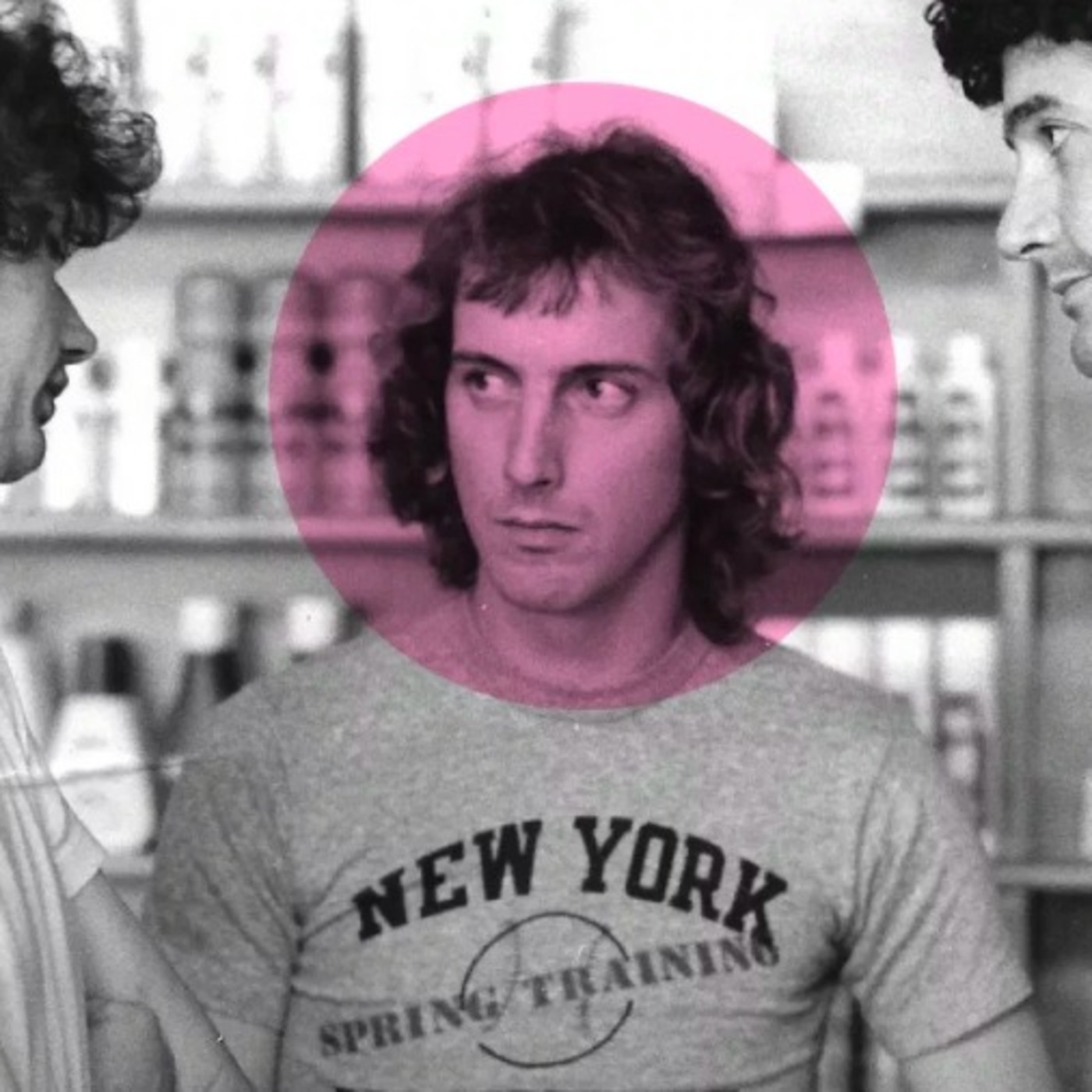
Gary Goldsmith
Update: 2020-04-23
Description
Pick up any New York Art Directors Club Annual from the sixties and you can feel the heat coming off the pages.
The Writers are using words previously confined to conversation, the Art Directors are trying to find new ways to present the information (‘Creating new pages’ as Helmut Krone put it.)
Then, the seventies.
A whole different story; the experimentation and energy appear to have dried up.
True, there are still lots of good thoughts and lines, but in terms of how it's presented the search for 'a new page' seems to have come to an end.
Maybe it was agreed at some Annual General Art Directors meeting that Art Directors should stop pfaffing around, decide once and for all what a god damn ad should look like!
If it was, the look they settled on was this;
All headlines should be set in a bold serif font.
Squeezed.
(In the spring you’re allowed to use initial caps for each word.)
Underneath the headline should be a photo (the more serious the better).
100 words of copy should be divided into two columns and placed under the picture.
Put a logo bottom left.
Job done.
It's odd, because the job of an art director is to set a distinctive tone and get attention.
To do both, you have to create something that looks different from the norm.
All companies aren't the same and unusual get's more attention than familiar.
As the '70's ended so did the Art Direction lockdown.
Art Directors began to play again.
One of the leading players was Gary Goldsmith.
Take a look at his VW Rabbit ad from 1981.
It looks nothing like an ad, let alone a VW ad.
Or his Chivas Regal Christmas ad.
Where's the lovely photograph of the whiskey they had in the previous 200 award-winning Chivas ads?
Giant letters turning up at all angles?
Copy out of a brightly coloured box, a box printed in a 5th colour (it added $1m to the cost of production).
What the hell was he playing at?
I guess that’s the point, look through the work below you can feel the joy of a human being communicating to others.
He'll hate me for saying this, but as a small child I used to look through the One Shows to find Gary's work.
Each client would always have its own distinctive look.
If the clients were premium the ads felt premium, if the clients were more basic the ads felt more basic.
Every campaign had a bespoke look.
The only thing they had in common was that they felt intelligent and playful.
I had a great chat with Gary, hope you enjoy it.
Comments
Top Podcasts
The Best New Comedy Podcast Right Now – June 2024The Best News Podcast Right Now – June 2024The Best New Business Podcast Right Now – June 2024The Best New Sports Podcast Right Now – June 2024The Best New True Crime Podcast Right Now – June 2024The Best New Joe Rogan Experience Podcast Right Now – June 20The Best New Dan Bongino Show Podcast Right Now – June 20The Best New Mark Levin Podcast – June 2024
In Channel


