


Not just Liquid Glass: 6 times Apple backtracked on a major design decision
Description
Apple’s new Liquid Glass interface has been somewhat controversial since it was introduced in June at WWDC 2025. While some users like the bold new look, others are not fans of how the exaggerated transparencies and fluid interactions. In response, Apple is finally letting users choose whether they want Liquid Glass or not in iOS 26.1.
Apple is known for following through on certain decisions, so when the company reverses a major decision, it’s quite shocking, although this is not the first time Apple has done so. Even a company like Apple acknowledges that not everyone embraces radical shifts.
Read on as we revisit some other decisions Apple made that were later reconsidered.
Liquid Glass
Let’s start with the most recent change that ended up being reversed in some ways, which is also one of the boldest changes in Apple’s design language in recent years.
Liquid Glass is what Apple calls the new interface in iOS 26, macOS 26, and its other operating 2026 systems. It was created as a “new material” to breathe new life into Apple software, which had otherwise been virtually unchanged since 2013, when iOS 7 introduced its polarizing “flat” interface.
 <button class="lightbox-trigger" type="button">
<svg fill="none" height="12" viewBox="0 0 12 12" width="12" xmlns="http://www.w3.org/2000/svg">
<path d="M2 0a2 2 0 0 0-2 2v2h1.5V2a.5.5 0 0 1 .5-.5h2V0H2Zm2 10.5H2a.5.5 0 0 1-.5-.5V8H0v2a2 2 0 0 0 2 2h2v-1.5ZM8 12v-1.5h2a.5.5 0 0 0 .5-.5V8H12v2a2 2 0 0 1-2 2H8Zm2-12a2 2 0 0 1 2 2v2h-1.5V2a.5.5 0 0 0-.5-.5H8V0h2Z" fill="#fff"></path>
</svg>
</button><figcaption class="wp-element-caption">
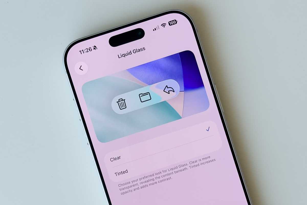
Apple added a toggle to essentially turn off Liquid Glass in iOS 26.1.
</figcaption></figure>Foundry
Back in 2013, many people criticized the new look of iOS 7. Although the company has made a lot of tweaks since the first release, there has never been an option to go back to the skeuomorphic design of iOS 6 and earlier versions. Apple made it clear that flat design was here to stay.
With Liquid Glass, Apple has seemingly given in to the negative opinions about Liquid Glass and has decided to give users a choice. Starting with the latest iOS 26.1 beta, users can choose the intensity of Liquid Glass with a new toggle available in Settings.
The “Clear” option is the default Liquid Glass that Apple wants you to use, but there’s also a “Tinted” option that increases contrast and reduces transparency, making everything look like older versions of iOS.
While letting users choose how they want their phone to look is a nice thing (especially considering accessibility), it’s really intriguing to think that Apple spent months highlighting the new Liquid Glass look only to give users the option to turn it off just a few weeks after release.
Butterfly keyboard
Apple’s “butterfly” keyboard mechanism was introduced in 2015 on MacBooks, with the purpose of making laptops thinner. However, due to the ultra-thin design of the keys, they ended up being more susceptible to failure as dust accumulated under the mechanisms.
At the same time, many users criticized the butterfly keyboard for its low key “travel,” which is the level of softness or hardness when you press the keys. Since the keyboard was super thin, typing on the butterfly keyboard became uncomfortable for some users after a while.
 <button class="lightbox-trigger" type="button">
<svg fill="none" height="12" viewBox="0 0 12 12" width="12" xmlns="http://www.w3.org/2000/svg">
<path d="M2 0a2 2 0 0 0-2 2v2h1.5V2a.5.5 0 0 1 .5-.5h2V0H2Zm2 10.5H2a.5.5 0 0 1-.5-.5V8H0v2a2 2 0 0 0 2 2h2v-1.5ZM8 12v-1.5h2a.5.5 0 0 0 .5-.5V8H12v2a2 2 0 0 1-2 2H8Zm2-12a2 2 0 0 1 2 2v2h-1.5V2a.5.5 0 0 0-.5-.5H8V0h2Z" fill="#fff"></path>
</svg>
</button><figcaption class="wp-element-caption">
The butterfly keyboard was such a headache, Apple implemented a repair program.
</figcaption></figure>Foundry
Apple stuck with the butterfly keyboard for many years, but the problems only got worse. It got so bad that it had to launch a replacement program for faulty keyboards, and it also faced many class action lawsuits because of this.
In 2019, Apple released a new 16-inch MacBook Pro that had a more conventional keyboard without the butterfly mechanism. All other MacBooks released since then have also abandoned the problematic ultra-thin keyboard.
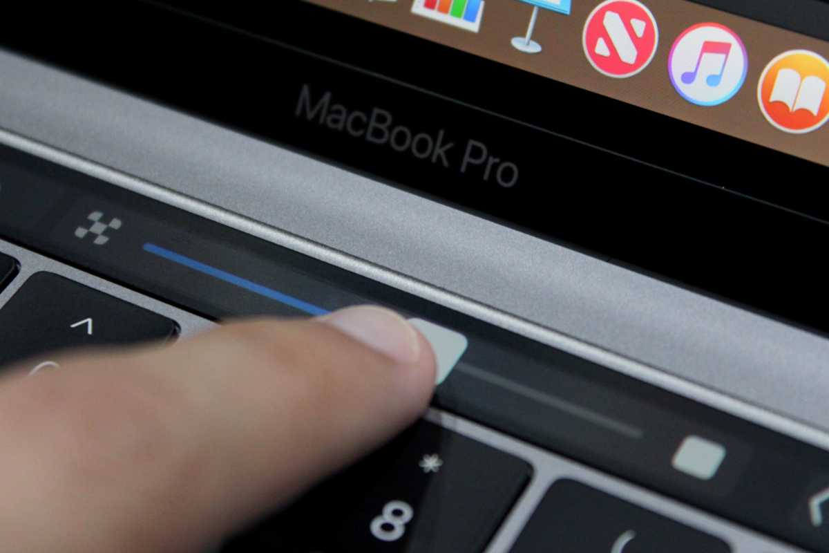
Touch Bar
The Touch Bar is another design choice that has divided opinion among Apple users. Introduced with the bold redesign of the MacBook Pro in 2016, the Touch Bar replaced the row of function keys on the keyboard. Instead, users were given a thin touch display that displayed different buttons depending on the app being used.
For example, if you opened the Photos app, it let you scroll through all your images. If you were watching a video, you could fast-forward or rewind just by swiping your finger on the Touch Bar, just like on an iPhone or iPad. The idea was really promising.
 <button class="lightbox-trigger" type="button">
<svg fill="none" height="12" viewBox="0 0 12 12" width="12" xmlns="http://www.w3.org/2000/svg">
<path d="M2 0a2 2 0 0 0-2 2v2h1.5V2a.5.5 0 0 1 .5-.5h2V0H2Zm2 10.5H2a.5.5 0 0 1-.5-.5V8H0v2a2 2 0 0 0 2 2h2v-1.5ZM8 12v-1.5h2a.5.5 0 0 0 .5-.5V8H12v2a2 2 0 0 1-2 2H8Zm2-12a2 2 0 0 1 2 2v2h-1.5V2a.5.5 0 0 0-.5-.5H8V0h2Z" fill="#fff"></path>
</svg>
</button><figcaption class="wp-element-caption">
The Touch Bar was probably ahead of its time.
</figcaption></figure>Foundry
To this day, Apple still argues against having full touchscreens on the Mac (although rumors suggest that this will change soon), so the Touch Bar aimed to bring touch to the Mac in a different way.
To be honest, the Touch Bar seemed really cool at the time, and it was probably way ahead of its time. However, not everyone liked the Touch Bar.
Since it had no tactile feedback, some people claimed they constantly pressed the wrong keys when trying to use the Touch Bar without looking directly at it. Also, since the Touch Bar had its own software, it was prone to becoming unresponsive from time to time, making it impossible to press the Esc key.
Apple kept the Touch Bar in many generations of MacBook Pro, but it also never expanded the feature to other Macs. In 2021, with the introduction of a redesigned MacBook Pro built with Apple Silicon, the Touch Bar was gone and replaced by the good old row of function keys.
During the keynote to launch the laptop, Apple said it brought back the “familiar, tactile feel of mechanical keys that pro users love” without directly acknowledging that the Touch Bar was gone.
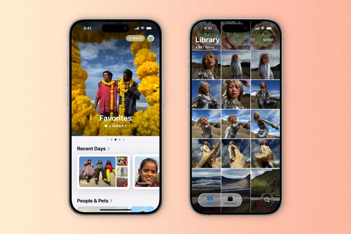
Photos
With iOS 18, Apple completely redesigned the Photos app on iPhone and iPad. While the idea was to make the app more customizable, many users didn’t like the changes and argued that the app had become too complicated to use.
 <button class="lightbox-trigger" type="button">
<svg fill="none" height="12" viewBox="0 0 12 12" width="12" xmlns="http://www.w3.org/2000/svg">
<path d="M2 0a2 2 0 0 0-2 2v2h1.5V2a.5.5 0 0 1 .5-.5h2V0H2Zm2 10.5H2a.5.5 0 0 1-.5-.5V8H0v2a2 2 0 0 0 2 2h2v-1.5ZM8 12v-1.5h2a.5.5 0 0 0 .5-.5V8H12v2a2 2 0 0 1-2 2H8Zm2-12a2 2 0 0 1 2 2v2h-1.5V2a.5.5 0 0 0-.5-.5H8V0h2Z" fill="#fff"></path>
</svg>
</button><figcaption class="wp-element-caption">
The Photos app in iOS 26 has somewhat reverted to its former interface.
</figcaption></figure>Foundry
Instead of spl


 United States
