


The Creative Process Behind the StudioPress.com Redesign
Description
In this week’s episode, we discuss the creative process behind the latest StudioPress.com redesign …
In this 29-minute episode Brian Gardner and Lauren Mancke discuss:
- The goals of the StudioPress redesign
- Changes to the existing logo
- Choices in typography and color
- Design of the Studicons font
- Styling and shooting the site’s photography
- Updates to functionality
- Plans for the future
Listen to StudioPress FM below ...
Download MP3Subscribe by RSSSubscribe in iTunes
The Show Notes
- StudioPress.com
- StudioPress 101
- Shop for Themes
- Unsplash
- Brian Gardner on Twitter
- Lauren Mancke on Twitter
The Transcript
The Creative Process Behind the StudioPress.com Redesign
Jerod Morris: Hey, Jerod Morris here. If you know anything about Rainmaker Digital and Copyblogger, you may know that we produce incredible live events. Well, some would say that we produce incredible live events as an excuse to throw great parties, but that’s another story. We’ve got another one coming up this October in Denver. It’s called Digital Commerce Summit, and it is entirely focused on giving you the smartest ways to create and sell digital product and services. You can find out more at Rainmaker.FM/Summit.
We’ll be talking about Digital Commerce Summit in more detail as it gets closer, but for now, I’d like to let a few attendees from our past events speak for us.
Attendee 1: For me, it’s just hearing from the experts. This is my first industry event, so it’s awesome to learn new stuff and also get confirmation that we’re not doing it completely wrong where I work.
Attendee 2: The best part of the conference for me is being able to mingle with people and realize that you have connections with everyone here. It feels like LinkedIn Live. I also love the parties after each day, being able to talk to the speakers, talk to other people who are here for the first time, people who have been here before.
Attendee 3: I think the best part of the conference for me is understanding how I can service our customers a little more easily. Seeing all the different facets and components of various enterprises then helps me pick the best tools.
Jerod Morris: Hey, we agree — one of the biggest reasons we host a conference every year is so that we can learn how to service our customers, people like you, more easily. Here are just a few more words from folks who have come to our past live events.
Attendee 4: It’s really fun. I think it’s a great mix of beginner information and advanced information. I’m really learning a lot and having a lot of fun.
Attendee 5: The conference is great, especially because it’s a single-track conference where you don’t get distracted by, “Which session should I go to?” and, “Am I missing something?”
Attendee 6: The training and everything, the speakers have been awesome, but I think the coolest aspect for me has been connecting with both people who are putting it on and then other attendees.
Jerod Morris: That’s it for now. There’s a lot more to come on Digital Commerce Summit, and I really hope to see you there in October. Again, to get all the details and the very best deal on tickets, head over to Rainmaker.FM/Summit.
Voiceover: StudioPress FM is designed to help creative entrepreneurs build the foundation of a powerful digital business. Tune in weekly as StudioPress founder Brian Gardner and VP of StudioPress Lauren Mancke share their expertise on web design, strategy, and building an online platform.
Lauren Mancke On this week’s episode, we’ll discuss the creative process behind the latest redesign of StudioPress.com.
Brian Gardner: Hey, everybody. Welcome back to StudioPress FM. I am your host, Brian Gardner, founder of StudioPress. Today, as always, I’m very excited to have Lauren Mancke come alongside again as the co-host of the show. Lauren, how are you doing this morning?
Lauren Mancke: Good, how are you?
Brian Gardner: I’m doing good. We get to talk about more fun stuff with StudioPress today. We are going to be talking about something fun and something that you and I worked together with. That is the latest redesign of the site. We figured the first couple weeks we’d talk about our stories. We would talk about the StudioPress redesign in the third part of this initial series here on the show.
The Goals of the StudioPress Redesign
Brian Gardner: Let’s just go right into it. January of this year, we launched a brand-new redesign at StudioPress. I think it had been three years. I think it was, what, back in 2013? And that was a Rafal design back in the day. Am I right there?
Lauren Mancke: Yeah. I think the previous one was at the end of 2013.
Brian Gardner: Okay, so a good two, two and a half years, which in my world is forever because I like to redesign every two months. As we know, it’s important for brand consistency to not do that. I think even before that, that must have been my design, the one that predated Rafal’s.
Believe it or not, I went onto Google and searched Google Images under StudioPress to see all of the various site design and things like that. It’s quite embarrassing because the way it looks now is incredible compared to the stuff that I did back in the day, which is completely embarrassing. So good job. And yes, by the way, we are going to give all design credit to everything StudioPress these days to you. How do you feel about that?
Lauren Mancke: Okay.
Brian Gardner: You’re good with that, right?
Lauren Mancke: Yeah.
Brian Gardner: All right. Here’s the thing. Let’s start at the top. You and I talked about the best way to talk through the redesign. We thought it would be maybe helpful or interesting to people who are fans of StudioPress for us to just break it down and just talk about the design process, from top to bottom, of the current site.
Changes to the Existing Logo
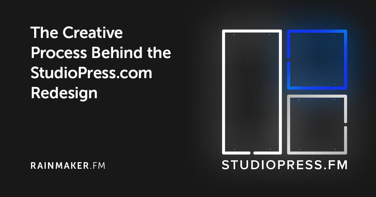
Brian Gardner: It’s interesting, the logo that we have, even though it’s evolved a little bit and the colors have changed, that was the original StudioPress logo from back in the day.
I don’t know if you remember this. Kevin Flahaut, he’s the one of the guys that works at Rocketgenius, the guys behind Gravity Forms, he actually came up with the original StudioPress concept for me back in the day, the three little rectangles and squares thing. Of course, since then, you’ve cleaned it up and have made it look much better and tighter. It’s cool to see the evolution from the silver gradient black and orange days to the flat black and blue and white days.
Let’s talk about the logo. I’m going to let you take the mic and just talk briefly about what we did with it and maybe why.
Lauren Mancke: Overall with the goals of the redesign, we really wanted to update the entire look and feel of the site. I think that first started with the logo design. We talked about tightening up that mark and making sure it was pixel perfect down at the favicon size all the way up to regular size, full size. The logo has transitioned over the years to different iterations.
We took that previous blue color and made it bolder, stronger, and brighter. We switched the font to Proxima Nova, and it’s very similar to the previous font. I think really the most noticeable letter is the R is a bit different.
Brian Gardner: Do you remember, I can’t remember off the top of my head what the previous font was that we used for the logo?
Lauren Mancke: I think it was Museo Sans.
Brian Gardner: Yeah, that sounds right because that’s Rafal’s favorite font. Everything Copyblogger and Rainmaker is Museo. To be honest, I think even before that, the original, original logo may have been Arial, which of course is laughable now. Yet people think Proxima Nova has been around for a while, but it’s such a timeless typeface. I’m looking at it now. I’m looking right at the screen. It looks so good. I like the rounded S’s and stuff like that. You did a great job tightening up the squares and just making it to a point where we can scale it up and down.
Lauren Mancke: Yeah, I think I started with that because it always bothered me that the lines weren’t crisp on the favicon. I started with that one pixel line.
Brian Gardner: That’s Lauren’s way of calling me out, by the way. That’s what happens when you’re not a trained designer. Yo


 to Make Money with WordPress, with Matt Mullenweg")


 United States
