Your SharePoint Content Map Is Lying to You
Description
Quick question: if someone new joined your organization tomorrow, how long would it take them to find the files they need in SharePoint or Teams? Ten seconds? Ten minutes? Or never? The truth is, most businesses don’t actually know the answer. In this podcast, we’ll break down the three layers of content assessment most teams miss and show you how to build a practical “report on findings” that leadership can act on. Today, we’ll walk through a systematic process inside Microsoft 365. Then we’ll look at what it reveals: how content is stored, how it’s used, and how people actually search. By the end, you’ll see what’s working, what’s broken, and how to fix findability step by step. Here’s a quick challenge before we dive in—pick one SharePoint site in your tenant and track how it’s used over the next seven days. I’ll point out the key metrics to collect as we go. Because neat diagrams and tidy maps often hide the real problem: they only look good on paper.
Why Your Content Map Looks Perfect but Still Fails
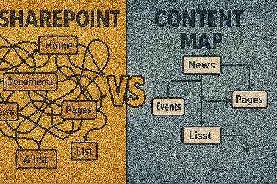
That brings us to the bigger issue: why does a content map that looks perfect still leave people lost? On paper, everything may seem in order. Sites are well defined, libraries are separated cleanly, and even the folders look like they were built to pass an audit. But in practice, the very people who should benefit are the ones asking, “Where’s the latest version?” or “Should this live in Teams or SharePoint?” The structure exists, yet users still can’t reliably find what they need when it matters. That disconnect is the core problem. The truth is, a polished map gives the appearance of control but doesn’t prove actual usability. Imagine drawing a city grid with neat streets and intersections. It looks great, but the map doesn’t show you the daily traffic jams, the construction that blocks off half the roads, or the shortcuts people actually take. A SharePoint map works the same way—it explains where files *should* live, not how accessible those files really are in day-to-day work. We see a consistent pattern in organizations that go through a big migration or reorganization. The project produces beautiful diagrams, inventories, and folder structures. IT and leadership feel confident in the new system’s clarity. But within weeks, staff are duplicating files to avoid slow searches or even recreating documents rather than hunting for the “official” version. The files exist, but the process to reach them is so clunky that employees simply bypass it. This isn’t a one-off story; it’s a recognizable trend across many rollouts. What this shows is that mapping and assessment are not the same thing. Mapping catalogs what you have and where it sits. Assessment, on the other hand, asks whether those files still matter, who actually touches them, and how they fit into business workflows. Mapping gives you the layout, but assessment gives you the reality check—what’s being used, what’s ignored, and what may already be obsolete. This gap becomes more visible when you consider how much content in most organizations sits idle. The exact numbers vary, but analysts and consultants often point out that a large portion of enterprise content—sometimes the majority—is rarely revisited after it’s created. That means an archive can look highly structured yet still be dominated by documents no one searches, opens, or references again. It might resemble a well-maintained library where most of the books collect dust. Calling it “organized” doesn’t change the fact that it’s not helping anyone. And if so much content goes untouched, the implication is clear: neat diagrams don’t always point to value. A perfectly labeled collection of inactive files is still clutter, just with tidy labels. When leaders assume clean folders equal effective content, decisions become based on the illusion of order rather than on what actually supports the business. At that point, the governance effort starts managing material that no longer matters, while the information people truly rely on gets buried under digital noise. That’s why the “perfect” content map isn’t lying—it’s just incomplete. It shows one dimension but leaves out the deeper indicators of relevance and behavior. Without those, you can’t really tell whether your system is a healthy ecosystem or a polished ghost town. Later, we’ll highlight one simple question you can ask that instantly exposes whether your map is showing real life or just an illusion. And this takes us to the next step. If a content map only scratches the surface, the real challenge is figuring out how to see the layers underneath—the ones that explain not just where files are, but how they’re actually used and why they matter.
The Three Layers of Content Assessment Everyone Misses
This is where most organizations miss the mark. They stop at counting what exists and assume that’s the full picture. But a real assessment has three distinct layers—and you need all of them to see content health clearly. Think of this as the framework to guide every decision about findability. Here are the three layers you can’t afford to skip: - Structural: this is the “where.” It’s your sites, libraries, and folders. Inventory them, capture last-modified dates, and map out the storage footprint. - Behavioral: this is the “what.” Look at which files people open, edit, share, or search for. Track access frequency, edit activity, and even common search queries. - Contextual: this is the “why.” Ask who owns the content, how it supports business processes, whether it has compliance requirements, and where it connects to outcomes. When you start treating these as layers, the flaws in a single-dimension audit become obvious. Let’s say you only measure structure. You’ll come back with a neat folder count but no sense of which libraries are dormant. If you only measure behavior, you’ll capture usage levels but miss out on the legal or compliance weight a file might carry even if it’s rarely touched. Without context, you’ll miss the difference between a frequently viewed but trivial doc and a rarely accessed yet critical record. One layer alone will always give you a distorted view. Think of it like a doctor’s checkup. Weight and height are structural—they describe the frame. Exercise habits and sleep patterns are behavioral—they show activity. But medical history and conditions are contextual—they explain risk. You’d never sign off on a person’s health using just one of those measures. Content works the same way. Of course, knowing the layers isn’t enough. You need practical evidence to fill each one. For structure, pull a site and library inventory along with file counts and last-modified dates. The goal is to know what you have and how long it’s been sitting there. For behavior, dig into access logs, edit frequency, shares, and even abandoned searches users run with no results. For context, capture ownership, compliance retention needs, and the processes those files actually support. Build your assessment artifacts around these three buckets, and suddenly the picture sharpens. A library might look pristine structurally. But if your logs show almost no one opens it, that’s a behavioral red flag. At the same time, don’t rush to archive it if it carries contextual weight—maybe it houses your contracts archive that legally must be preserved. By layering the evidence, you avoid both overreacting to noise and ignoring quiet-but-critical content. Use your platform’s telemetry and logs wherever possible. That might mean pulling audit, usage, or activity reports in Microsoft 365, or equivalent data in your environment. The point isn’t the specific tool—it’s collecting the behavior data. And when you present your findings, link the evidence directly to how it affects real work. A dormant library is more than just wasted storage; it’s clutter that slows the people who are trying to find something else. The other value in this layered model is communication. Executives often trust architectural diagrams because they look complete. But when you can show structure, behavior, and context side by side, blind spots become impossible to ignore. A report that says “this site has 30,000 files, 95% of which haven’t been touched in three years, and a business owner who admits it no longer supports operations” makes a stronger case than any map alone. Once you frame your assessment in these layers, you’re no longer maintaining the illusion that an organized system equals a healthy one. You see the ecosystem for what it is—what’s being used, what isn’t, and what still matters even if it’s silent. That clarity is the difference between keeping a stagnant archive and running a system that actually supports work. And with that understanding, you’re ready for the next question: out of everything you’ve cataloged, which of it really deserves to be there, and which of it is just background noise burying the valuable content?
Separating Signal from Noise: Content That Matters
If you look closely across a tenant, the raw volume of content can feel overwhelming. And that’s where the next challenge comes into focus: distinguishing between files that actually support work and files that only create noise. This is about separating the signal—the content people count on daily—from everything else that clutters the system. Here’s the first problem: storage numbers are misleading. Executives see repositories expanding in the terabytes and assume this growth reflects higher productivity or retained knowledge. But in most cases, it’s simply accumulation. Files get copied over during migrations, duplicates pile up, and outdated material lingers with no review. Measuring volume alone doesn’t reveal value. A file isn’t valuable because it exists. It’s valuable because it’s used when someone needs it. That’s why usage-based reporting should always sit at the center of content assessment. Instead of focusing on how many documents you have, start tracking whi

